Audio Transcript
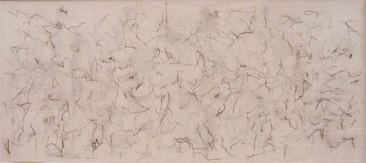
In 1998 I was working at Ucross, which is an artist’s residency in central Wyoming. As I am always interested in the quality of space in my work, I was trying to figure out the relationship of my mark to that environment. Central Wyoming is a wide-open, big landscape, with exposed plains and mountains. I started to explore this sense of vast space in various ways: in some drawings I worked with the extended mark—a long gestural line that travels across the paper; and here in this drawing, I worked with the mark as a smaller, basic unit.
Now, there are several things that have always seemed related for me: architecture, typography, landscape, and the language of marks. So, in trying to make sense of my own being in that sparse landscape—as in, how does a person get along in a place that exposed and remote—I first started to look at the local architecture to see what it could tell me. Well, the architecture was very plain and perfunctory. Ucross is a former ranch—and the buildings are pre-fab farm structures. At first this felt very ordinary and dull. Then I started to appreciate a sense of pragmatism there. I was thinking about the marks I had been using: highly gestural marks that were sometimes “fussed” over. I wondered if these made sense out there, in a place where human effort had to be more functional. I needed marks that were more basic and could get the job done.
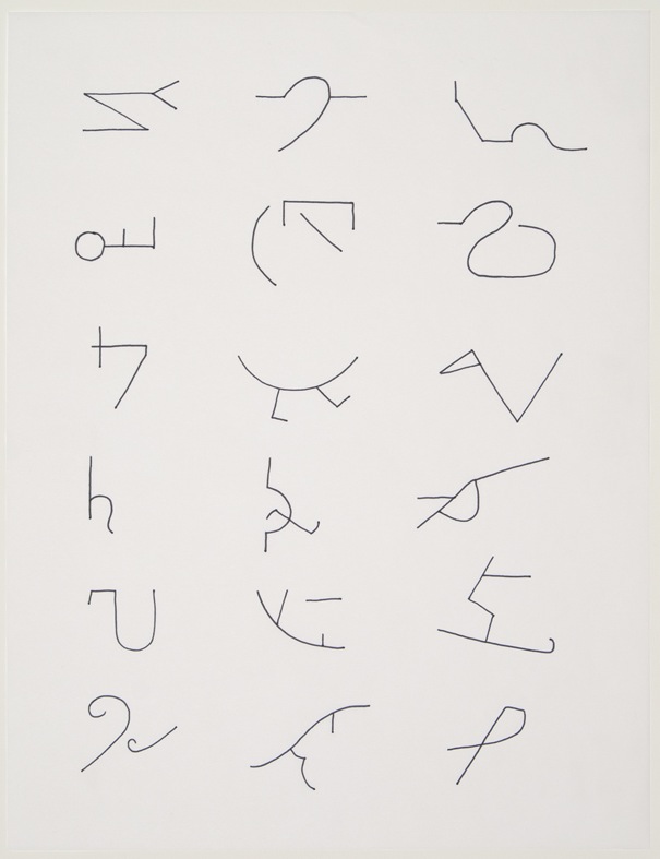
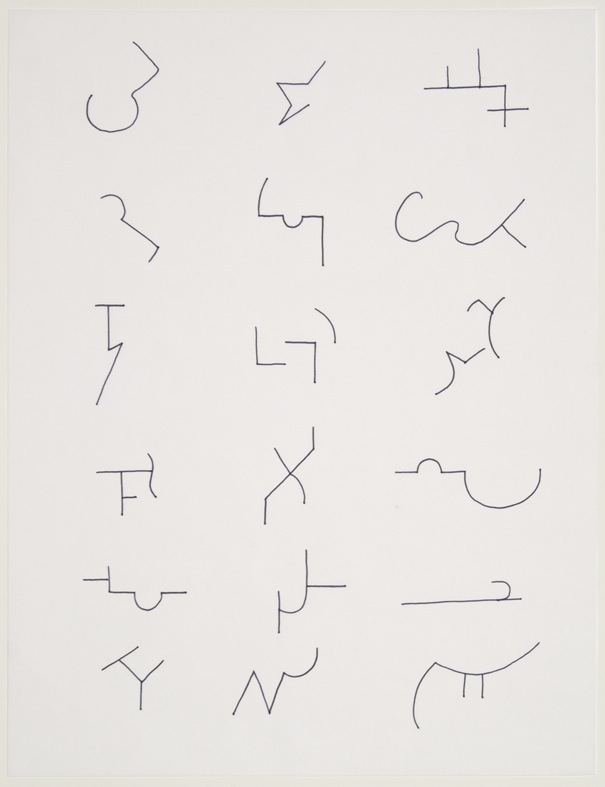
One of the older buildings on the property was a former hunting cabin, and the old books from that time were still on the shelf. Among them, a thick catalog of livestock brands, listed by ranch owner. This was very interesting to me. I was especially drawn to the more abstract brands, where you can’t recognize a letterform or a pictorial element. Here too there was wonderful evidence of that western pragmatism. The necessity of being simple, of course, comes out of the fact that the forms have to be made out of iron. I was very interested to see how combinations of a few curves and straight forms could yield such an extensive vocabulary. So I started to make these small studies on paper; I believe some of the forms here were copied from that book, and most of them I made up, in the spirit of those brands.
So after making these smaller studies, I started work on the big drawing, and this drawing started out with a field of these kinds of marks. The field was kind of new for me. I was used to using marks that got very worked at times, erased, layered—and often concentrated into some non-figurative composition. But this drawing, I steered away from that. And although you can see that there is still quite a bit of erasure, I feel that the mark here is more exposed, and that seemed to fit my experience there.
In school, I had developed a love of letterforms and typography from studying graphic design. Experiences of brush writing and hand-painting of letterforms helped me to become a very attentive handler of characters and to understand the visual side of verbal language. When I started to work as an artist, I knew I had to let go of that control, to send out my marks and lines more freely. That came slowly.
I can’t help but mention Cy Twombly here, especially as he’s on everyone’s mind right now. I think of him because he was a person who really helped me to engage with drawing as being the record of the experience of drawing, more than the shaped result. Twombly’s paintings are full of that liberated writing.
Me, I am somewhere in between: I work with the tension between mark as form, and mark as record.

Speaking about Eva Hesse’s work, Mel Bochner once remarked, “…certain art looks back at you with the time the artist has spent looking at it.”1 Christine Hiebert’s L.99.1 (1999) looks back at the viewer in that way. The artist’s work, measured and unhurriedly produced, deals in an economy of means; erasure—by hand or by electric sander—has as much of a presence as the charcoal lines that recede into the rabbit-skin glue coating the work’s surface. Hiebert’s implementation of her medium speaks to drawing as process, to the work as an experience of the time the artist spent creating it.

L.99.1 is large—48 x 106 ½ inches—and Hiebert’s charcoal marks work their way into almost every square inch. This expansive allover-ness of Hiebert’s tender yet unstable markings, coupled with their faint promise of intelligibility, finds affinities with Cy Twombly’s works from the late 1960s. Hiebert, who studied graphic design, developed an early love of typography and its characters. Particularly when considered in light of Hiebert’s three smaller “Brand Drawings” from 1998-1999, also included in the exhibition, L.99.1’s marks resemble unraveling symbols—representation unraveled into pure form, and form turned record of experience. The hushed, unrushed progressions of Hiebert’s lines invite the viewer to traverse the length of the work, absorbing its hesitancies and deliberations. The charcoal marks seem to fade forward and backward in depth, the line becoming heavy and emphatic only to slip away into a whisper; in this way, each progression of Hiebert’s line seems to verge on retreat.

Some gestures of line float to the surface, begging individual consideration. These marks at times may strike a viewer as humorous, quick and silly or slow and pensive, even tragic, and yet we are hard-pressed to explain why—for line here is reduced only to line, and we respond without the crutch of specific connotation or association. In Hiebert’s words, these lines “…[thrive] in a void of not knowing—a void that seems dangerous at first but then offers mobility and freedom, and, therefore, hope.”2 L.99.1’s untethered gestures liberate the artist, and consequently the viewer, to explore the instability of unfixed reference. As if to make plain this ‘void of not knowing,’ the hope of possibility, Hiebert incorporates erasure, sanding through her lines and, at times, wearing down the paper to nothingness. These glowing patches of bright white interspersed with enigmatic markings propose that not only is a stable reading of line—we might even say of life—unavailable, but perhaps such a reading isn’t even preferable. This unfixed state of freedom, mobility, and instability, in balance and dialogue with the nothingness from which it emerges, suggests expression free from specific signification or purpose; Hiebert’s is a pre-linguistic, pre-representational line.

By these lights, the relationship between the smaller “Brand Drawings,” which have never been shown before, and the larger work becomes telling. Made during a residency in central Wyoming, the three smaller drawings found their impetus from directories of regional cattle brands that the artist encountered. Hiebert selected the brands that were pared down to their most basic forms, symbols so abstract that one could not recognize a letterform or pictorial content. Branding traditionally ascribes association or ownership in the clearest, sparest way. These forms mean nothing to the uninitiated; yet in using them, Hiebert does not seem concerned with individual ranchers’ branding practices, but rather with playing with the language of the brand, its basic forms and functions, so that she might explore what it means to pare down line until meaning slides off of it.
These “Brand Drawings” then served as studies for the larger work. Viewing them in comparison, we find we glean much less from the clearly defined symbols, however foreign, than we do from the fits and starts of Hiebert’s disparately strong, fading, and capricious lines in L.99.1. In her delicate erasure, in the varied pressure that takes her lines from dark to pale, Hiebert charts her experience through the void of unknowing. Certain gestures and discoveries emerge, and as they do a certain humanity returns to drawing—that nothingness common to all, and from which everything emerges. It becomes an intimate record of experience rather than an intended result. As such, the inner, pre-linguistic wanderings of human thought and experience are conjured without recourse to language’s limitations, yet they are allowed to play in language’s territory. Hiebert states it thusly: “Assuming that language is an exoskeleton for the internal self, the visual language of the marks refer to that internal structure.”3 In L.99.1, the marks fade in and out of nothing, and Hiebert works hard, though delicately, to let that nothingness show through.
1. Mel Bochner quoted in Briony Fer, The Infinite Line: Re-Making Art After Modernism (New Haven and London: Yale University Press, 2004), 118.
2. Christine Hiebert, An Architecture for Thinking, Victoria Munroe Fine Art exhibition catalogue (Boston: Victoria Munroe Fine Art, 2004), 1.
3. Christine Hiebert, unpublished artist’s statement, 2001.
Christine Hiebert Biography
Andrea Nitsche-Krupp Biography
Pingback: Part 5 – Time Lines – rsidney: investigating drawing